Institute of Astrobiology
The story behind the identity
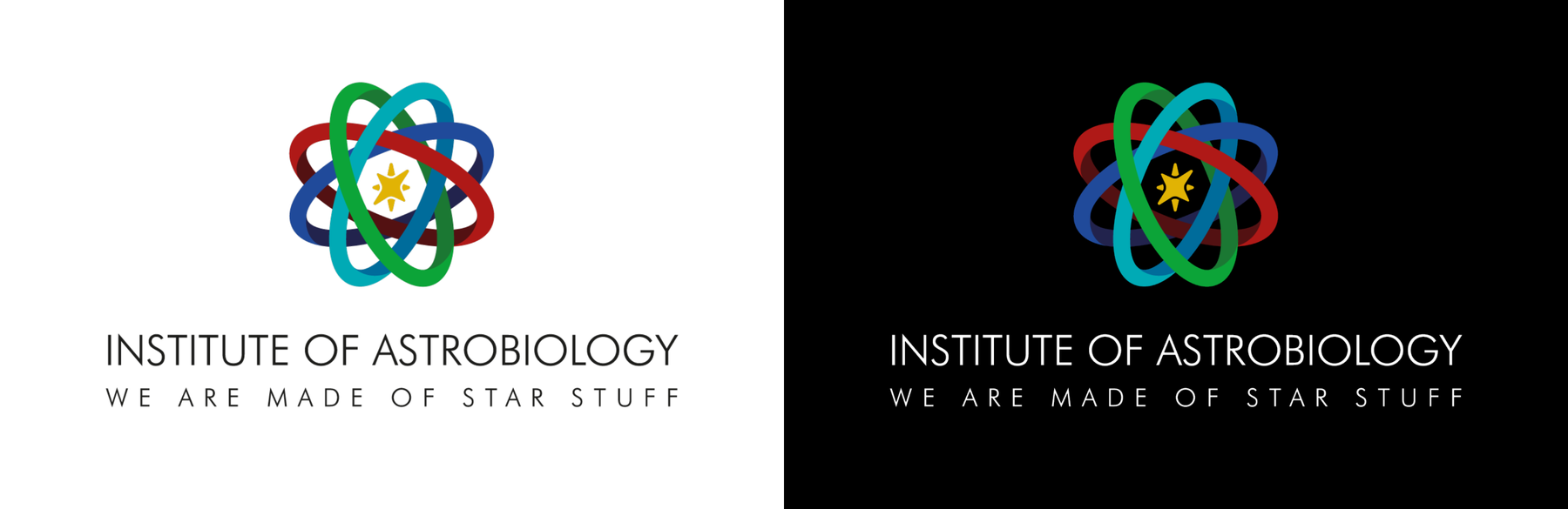
The identity of the Institute of Astrobiology brings together references to matter, life and the universe in a single, recognisable mark. Its meaning is built through a series of connected elements: orbital forms, a central spark, an interwoven structure and a colour palette derived from the spectral lines of carbon.
Logo design: Eriana Panopoulou, Dimitris Kastakioris
Our mission and aspirations
We approach the universe with restless wonder and scientific rigor. Navigating the multidisciplinary complexity of this field of study, looking for likeminded individuals to join our journey. In pursuit of new frontiers and grander mysteries. An homage to human curiosity.
Astrobiology begins with questions larger than any one discipline can answer.
What should we be asking?
How does life emerge?
What exactly should we consider life?
Are we alone?
What should the identity feel like?
✦ Curious
It should invite discovery rather than explain everything immediately.
✦ Rigorous
Its deeper meanings should have a genuine scientific foundation.
✦ Universal
It should speak about life without defining it through one particular biological form.
✦ Interdisciplinary
It should express the meeting of different scientific fields.
✦ Simple
All of this should resolve into one clear, recognisable symbol.
The orbital forms
From the elemental to the cosmic
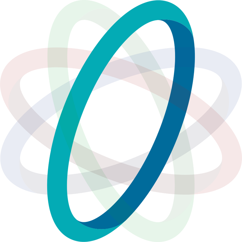
The mark connects the cosmic and the biological. Its orbital forms evoke the elements that make up matter, creating a visual connection between the smallest building blocks of the physical world and the larger structures of the universe. Their repeated, intersecting paths give the symbol a sense of movement and continuity, while remaining simple enough to work as a clear and recognisable mark.

The central spark
Life at the centre
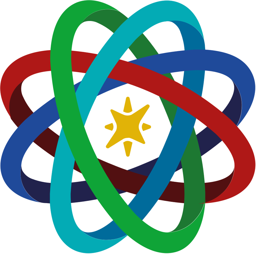
At the centre of the mark is a spark. It can be read simultaneously as a star and the spark of life. Its position at the heart of the symbol reflects the central question of astrobiology: understanding the origin, evolution and possibility of life in the universe.
The interwoven structure
Many sciences. One question.
Astrobiology brings together disciplines including astronomy, biology, chemistry, geology and planetary science. The interwoven forms represent these different fields as distinct paths that continuously cross, interact and contribute to a shared pursuit. At the centre of them all is one question: life.
Carbon as a hidden signature
Colour becomes information
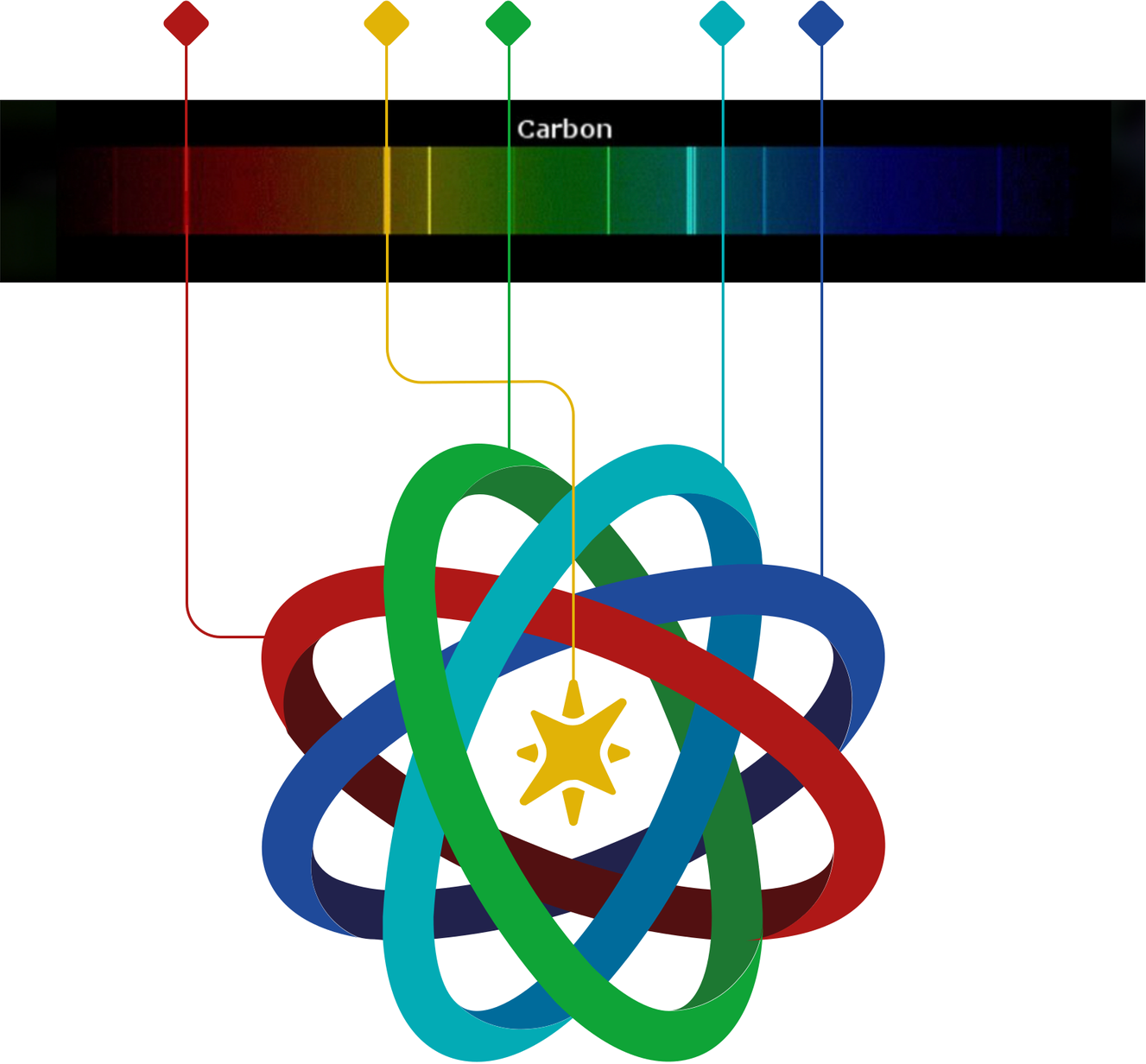
The colours of the orbital forms are inspired by the visible spectral lines of carbon. Carbon forms the molecular backbone of all life currently known to science, embedding a subtle reference to the chemistry of life within the identity itself.
This allows colour to carry meaning rather than function only as decoration. The scientific reference remains understated, but it gives the palette a direct connection to the idea of life.
The tagline
We’re made of star stuff
As an optional addition to the identity, the tagline “We’re made of star stuff” offers a subtle tribute to Carl Sagan, a pioneering figure in exobiology and the scientific exploration of life beyond Earth. The phrase reflects the connection between the elements formed in stars and the matter from which life emerges, reinforcing the central idea behind the identity. While the mark is designed to stand independently, the tagline accompanies it in selected applications, adding a human and poetic dimension to its scientific meaning.
The identity system
Designed to work as an identity
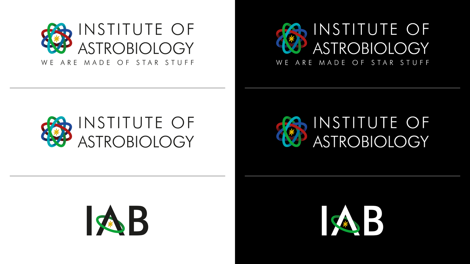
The mark was developed to function across a range of formats and applications. It can appear as a complete institutional logo, in horizontal or vertical arrangements, or as a more compact abbreviation. Across these variations, the same visual principles remain consistent: the orbital structure, the central spark, the interwoven form and the carbon-derived colour palette.
Colour
A palette with a scientific origin
The primary palette is inspired by the visible spectral lines of carbon, carrying the scientific reference of the identity into its broader visual system. Darker secondary tones extend the core colours, providing greater contrast and flexibility across light and dark applications while maintaining a consistent relationship to the mark.
Primary colours
#E2B408
RGB 226 / 180 / 8
CMYK 0 / 20 / 96 / 11
#03ACB6
RGB 3 / 172 / 182
CMYK 98 / 5 / 0 / 29
#0FA538
RGB 15 / 165 / 56
CMYK 91 / 0 / 66 / 35
#204B9B
RGB 32 / 75 / 155
CMYK 79 / 52 / 0 / 39
#B01917
RGB 176 / 25 / 23
CMYK 0 / 86 / 87 / 31
Secondary colours
#016C9C
RGB 1 / 108 / 156
CMYK 99 / 31 / 0 / 39
#1E7833
RGB 30 / 120 / 51
CMYK 75 / 0 / 58 / 53
#22234D
RGB 34 / 35 / 77
CMYK 56 / 55 / 0 / 70
#531112
RGB 83 / 17 / 18
CMYK 0 / 80 / 78 / 67
Typeface
A clear, rational voice
Futura BT was chosen for its geometric construction, clarity and restrained modernist character. Its precise forms complement the scientific nature of the institute while remaining open and approachable. Light is used for the primary identity and larger typographic moments, while Medium provides emphasis and greater legibility where needed.
Institute of Astrobiology
We are made of star stuff
Aa Bb Cc 0123456789 — Light
Aa Bb Cc 0123456789 — Medium
Shown here in Jost, a freely available web font close to Futura.
Together, these elements create an identity that is simple at first glance, while revealing a deeper scientific meaning on closer inspection.